14.08.2023
Uncategorised

We are pleased to announce major visual changes, including a new website, a logo combining words and graphics to identify the brand, and new packaging designs for our products.
This rebranding initiative is another step in the development of Feniks Pellets, a brand committed to providing its customers with the best products and excellent service.
Our new website is a practical, user-friendly online space that provides easy access to information about products, their uses, news and promotions. The updated site structure and intuitive layout make navigation easier, allowing visitors to find the information they need quickly. New features also make it possible to easy ordering and contacting Feniks Pellets customer service.
The new logo, consisting of a symbol and the Feniks Pellets wordmark, reflects the values on which the company is founded – quality, reliability and a sustainable approach to pellet production.
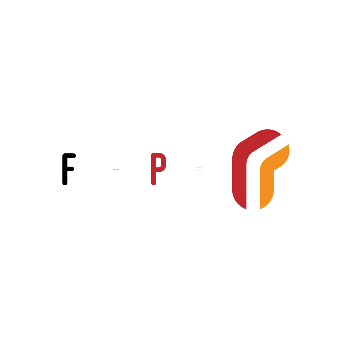
The Feniks Pellets logo consists of two basic elements: a symbol and a typographic representation of the brand name. The symbol visually combines the shape of the letter F within a P, together evoking a rising phoenix, as well as energy and warmth.
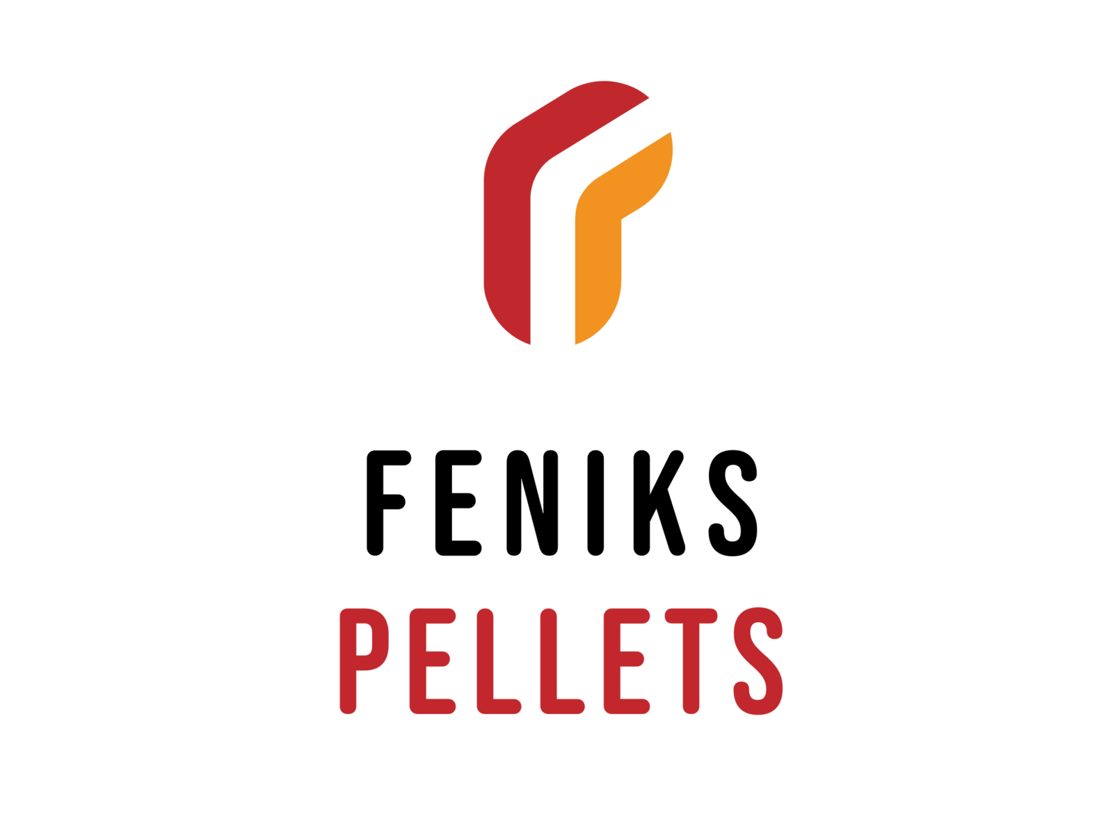
The primary colours evoke glowing red embers and the orange flame of burning pellets.
The typography uses a rounded sans-serif typeface to echo the shape of the product offered by the brand: wood pellets, a clean, environmentally friendly biofuel. Designed in a modern style, the logo symbolises the brand’s commitment to the environment and innovation. The new visual identity aims to make the brand stand out in the market, attracting customers’ attention and highlighting its positive values.
We have also refreshed our product packaging. The packaging is now attractive, practical and functional.
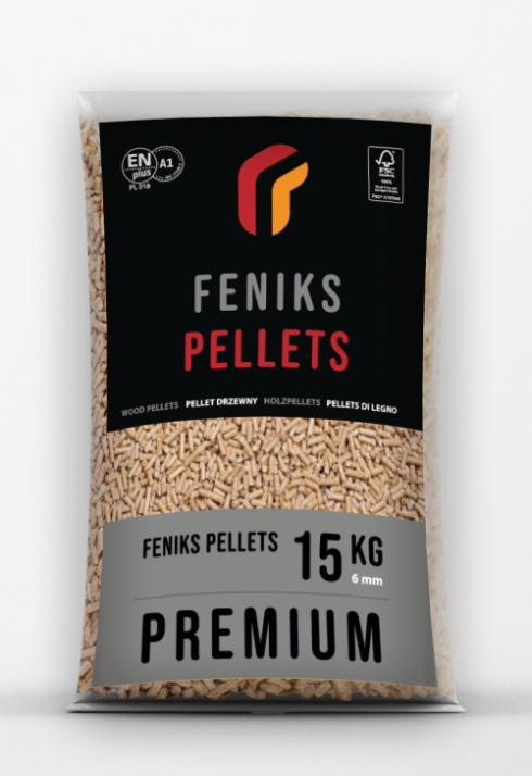
The new design improves brand visibility and makes it stand out on the shelf, while ensuring proper protection and maintaining the pellets’ high quality.

„Feniks Pellets is proud to present our new brand identity. These changes are the result of our continuous pursuit of excellence and commitment to providing our customers with the best products. The new website, logo, graphic symbol and packaging are just some elements of our comprehensive rebranding strategy. We want our customers to have easy access to information about our products and enjoy even better-quality pellets. This is another step in our mission to provide comfort and sustainable heating” – says Jarosław Rak, President of the Management Board of Poli Trade Polska Sp. z o.o., which owns the Feniks Pellets brand.
The visual communication strategy, new website and rebranding are the work of the Addvanced agency specialising in branding, brand creation and digital communication.